Categories
Design Tips & How To's Web Development

Please don’t customize social media icons

When I put on my front-end developer hat, I’m often the last line of defence between the client and an unfortunate typo, bad idea or missed opportunity. I’m the last pair of eyes to examine a design before it hits the development environment. Designers probably hate me for it, but if I see a design choice that doesn’t make sense to me, I’ll mention it.

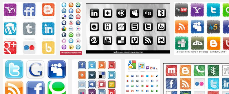
One of the most common design choice that irks me is customized social media icons. Web designers seem to have an inescapable need to redesign Facebook, Twitter, Google+, LinkedIn, whatever.app’s icons to match the overall look and feel of the site. One one hand, I can almost understand the appeal, these logos can stick out like a sore thumb. On the other hand, that’s the entire point!

Brands like Twitter and Facebook spend massive amounts of time and money tweaking their identity. They spend even more money marketing their brand, getting it in everybody’s face. Facebook’s white ‘F’, Twitter’s blue bird are immediately recognizable. In my humble opinion, if you actually want website’s visitor to notice and use those sharing features I’m supposed to implement, it’s probably a good idea to follow the social network’s brand guidelines. If you want people to share your content or follow the @account, it’s not a great idea to have the social media icons BLEND IN WITH THE REST OF THE SITE!

I’d love to do an A/B test to examine this theory.
4 replies on “Please don’t customize social media icons”

My opinion had been that if someone on the site was looking to follow the site on a social network, they should be able to find the right buttons easily. But if they’re not looking for it, it shouldn’t stick out above the content. By using the logo, but changed to blend in, it doesn’t scream for attention, but should be recognizable when someone wants to see it.

I can agree with that. *If* someone is looking to follow the site, they’ll search out the buttons.

My gut feeling says, by only taking those use-cases into consideration, you’ll ignoring the majority of people. People who casually discover things organically.

My issue with leaving the social media icons as-is, is the lack of consistency in design. I find it looks messy. I always notice the custom icons on websites and if the company/individual has interesting content on their site, I naturally click on their SM links regardless of design.
IMO, they don’t need to stick out like a sore thumb because Social Media isn’t a secret. Most companies/individuals are on the various platforms and most people know that. I don’t think they go unnoticed.

There is tension between the goal of a beautiful looking design and a high performing design in terms of clicking goals. Designers are usual incentivized to make beautiful looking designs, even though this might not be in the best interest to their client.

Leave a Reply

Only people in my network can comment.