Category: Tips & How To’s
-
Using Jetpack’s Photon CDN to host images in custom WordPress themes

Photon is a great free image CDN that you can use with any self-hosted WordPress install via Automattic’s Jetpack suite of plugins. Photon uses wordpress.com’s infrastructure to host your site’s images on one of the fastest CDN globally. I highly recommend enabling it on every WordPress install. If your site is on cheap shared hosting, it…
-
5 Tips for Playing Board Games With Younger Kids
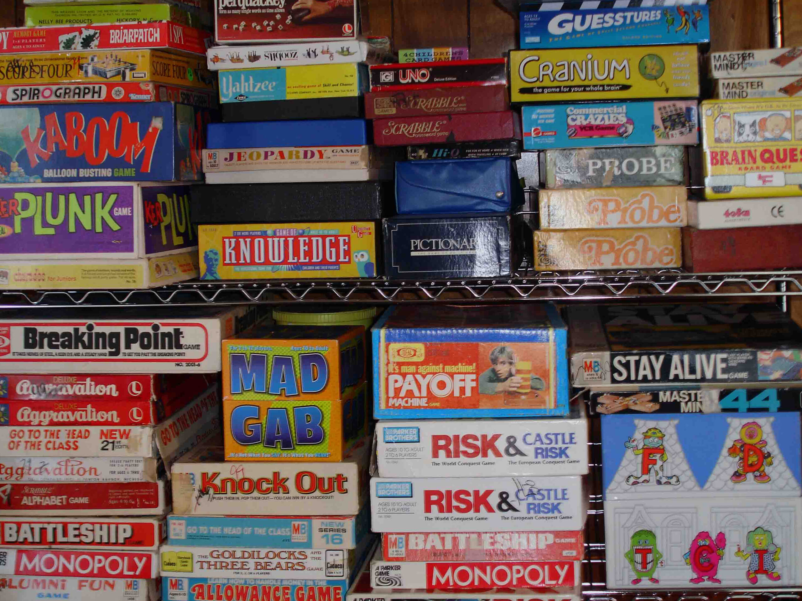
I have two kids, boys, currently aged 5 and 7. We’ve been playing board games as a family almost from birth. Over the years, I’ve been constantly impressed by their ability to pick up and enjoy some of the most complex and involved modern board games. The 21st century board game explosion has spawned hundreds of great games geared…
-
How To: Tweak Disqus CSS for Twenty Fifteen Theme
After installing the twenty fifteen theme I found that disqus’ comments were butting up against the edges of the layout. You can fix this by adding the following Custom CSS @media screen and (min-width: 59.6875em) { #disqus_thread { margin-top: 8.333%; margin-left: 8.333%; margin-right: 8.333%; } } @media screen and (min-width: 38.75em) { #disqus_thread {…