When I put on my front-end developer hat, I’m often the last line of defence between the client and an unfortunate typo, bad idea or missed opportunity. I’m the last pair of eyes to examine a design before it hits the development environment. Designers probably hate me for it, but if I see a design choice that doesn’t make sense to me, I’ll mention it.
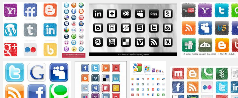
One of the most common design choice that irks me is customized social media icons. Web designers seem to have an inescapable need to redesign Facebook, Twitter, Google+, LinkedIn, whatever.app’s icons to match the overall look and feel of the site. One one hand, I can almost understand the appeal, these logos can stick out like a sore thumb. On the other hand, that’s the entire point!
Brands like Twitter and Facebook spend massive amounts of time and money tweaking their identity. They spend even more money marketing their brand, getting it in everybody’s face. Facebook’s white ‘F’, Twitter’s blue bird are immediately recognizable. In my humble opinion, if you actually want website’s visitor to notice and use those sharing features I’m supposed to implement, it’s probably a good idea to follow the social network’s brand guidelines. If you want people to share your content or follow the @account, it’s not a great idea to have the social media icons BLEND IN WITH THE REST OF THE SITE!
I’d love to do an A/B test to examine this theory.