Category: Review
-
Windows 8 Review
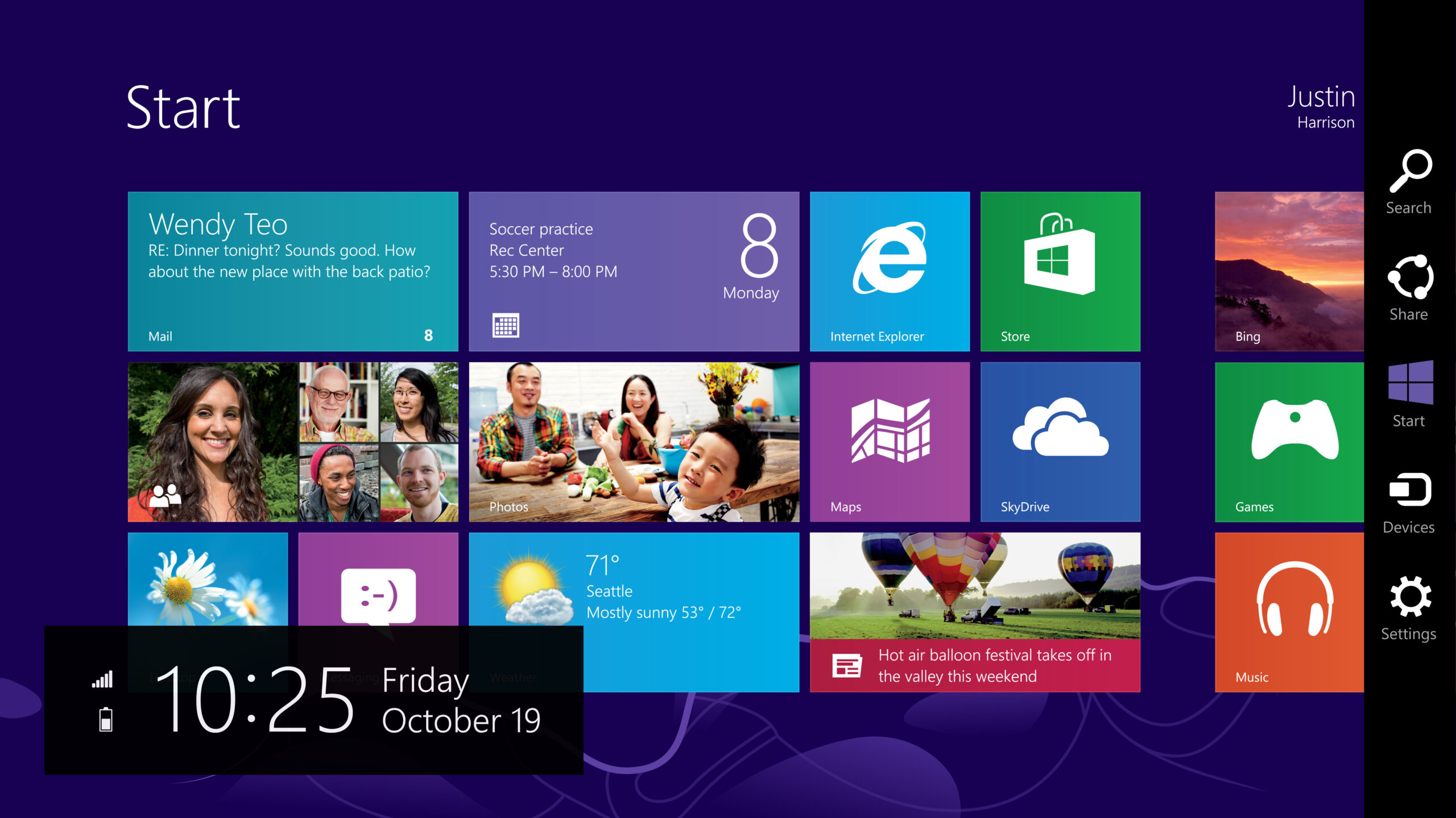
Last week Microsoft Canada invited me to a hands-on demo with Windows 8 and their Surface RT tablet. The demo consisted of a hotel room, 3 Microsoft PR People – the business guy, the soccer mom and the xbox guy – and all the Windows hardware they could “fit in one suitcase” (they mentioned that…
-
Hyper-local Weather Forecasts
The future is here. Today the Weather Network rolled out “PointCast” a service developed in house (over the past 15 years!) that provides 1-km forecast and weather data. That’s a screenshot of my weather at home vs the “Winnipeg” weather station (likely) 10km away at The Forks. As you can see, it’s quite different. From…
-
Band of the day: Purity Ring
They sort of remind me of a gentler Crystal Castles. [soundcloud url=”http://api.soundcloud.com/tracks/9125440″ iframe=”true” /] A bunch more tracks on Hype Machine.