I sometime describe myself as “an aspiring cyclist.” I enjoy cycling a lot and recognize all its environmental and health benefits, but unfortunately like most Canadian parents my day-to-day is not very conducive to a cycling-based lifestyle. In Winnipeg, as is the case in most North American cities, the built environment abandoned the bicycle sometime in around the 1950s when we started to replace electric trams with diesel buses. So at best, I can only aspire to be a cyclist.
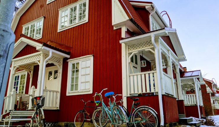
Earlier this February, I had the pleasure of joining the Counterpoint team in Oulu, Finland for a winter cycling retreat of sorts. Oulu is a city barely south of the Arctic Circle in Northern Finland. It has a population and land area of roughly half that of Winnipeg, yet it boasts and incredible 600km of cycle/pedestrian pathways, including over 100 underpasses. I spent 6 days (logged 100km) exploring the city by bicycle.
In addition the the many underpasses, in the few places where cyclists are required to intersect with a car crossing Oulu’s streetlights are designed to sense cycle traffic and prioritize it by switching the car traffic lights to red. With this system we were able to cycle the 10km from our suburban airbnb to the downtown core without stopping. The cycle path system also includes comprehensive way finding and a west-to-east numbering system making navigation easy, even without Google maps.
Overall it’s an incredibly well designed system, built from the ground up with cycling as a priority. Unlike our systems here where we are largely trying to wedge a cycling network into an environment built for cars.
But unpinning Oulu’s cycling network is something that Winnipeg already has. Something we could adopt in many places around the city without spending massive amounts of money building new infrastructure… two meter wide “sidewalks.”
Examples


Every single roadway in Oulu (and I can only assume much of Finland) includes a roughly 2 meter wide light traffic right of way along side at least one side of the car/truck right of way.
Have We Been Overthinking Cycling Infrastructure?
Dedicated protected bike lanes are great and super important for much of the existing road network that we have in cities like Winnipeg. But they’re also very expensive to build and they’re hard to approve since they often involve disrupting the ever-important car. Thing is, in my entire time in Finland I didn’t encounter a single “bike lane.” I’m not sure they actually have any.
And when I got in to my car for the first time after getting back and drove down Ness avenue, it immediately hit me! We already have wide sidewalks all over the city! We are just using them poorly.
Cycling On The Sidewalk
Under current city bylaws it is technically illegal for adults to cycle on the sidewalk. Many parts of the city have <1m wide sidewalks and on those narrow sidewalks it’s understandable, they’re not really wide enough for a cyclist to share with a pedestrian.
Unfortunately, this regulation sends a strange message that bikes are dangerous and completely sidesteps the real problem of sidewalks that are much too narrow.
I’d propose changing this legislation to allow for wider sidewalks to be designated shared pedestrian and cycling pathways. Explicitly, with well placed signage and a proper public awareness campaign. (Oh and while we’re at it get rid of those lame no skateboarding laws too!)
Examples of Poor Use of Space

Much of Ness Avenue has wider than average sidewalks. For some reason the utility poles and signage is in the middle of the sidewalk! Move that junk to the outside edge and suddenly you have cycling infrastructure on Ness! For much lower cost than ripping up the street and building some bike lanes.

Portage Avenue has sidewalks that would be plenty wide for cyclists to share with pedestrians, if it wasn’t for all the random garbage cans, no parking signs and other junk. Moving those out of the way would cost nothing at all. Perhaps we’d need some new regulation to explicitly describe how we are allowed this space. But do that and suddenly we have cycling infrastructure down portage!

Similar story on Southbound Henderson Highway. The sidewalk is plenty wide, but it has all kinds of random, no-sidewalk junk all over the place. Get rid of that junk and SUDDENLY WE HAVE FREE CYCLING INFRASTRUCTURE!
Conclusion: Just Do It
I’m sure I could find many many more examples like these around the city. I seem to recall the city “upgrading” these sidewalks a couple of decades ago so that they could stop replacing grass that was destroyed by the road salt every winter.
A couple of simple bylaw changes and relatively small scale projects to move a couple of light posts and garbage cans and suddenly we’ve unlocked kilometers of cycle paths.
I’m not saying we don’t need dedicated bike lanes and active transportation paths through our beautiful forest. I am just saying that if we see those as the only solutions, we are making the problem more difficult and costly than it needs to be.

