Last week Microsoft Canada invited me to a hands-on demo with Windows 8 and their Surface RT tablet. The demo consisted of a hotel room, 3 Microsoft PR People – the business guy, the soccer mom and the xbox guy – and all the Windows hardware they could “fit in one suitcase” (they mentioned that a number of times, as if packing a suitcase was some amazing feat).
By now, I’m sure most of you have read a Windows 8 review or two. So I’ll keep this brief, I’m going to go over a few areas that stood out to me.
Unfortunately, they were not able to lend me a review unit, so this review will have to be based on a 7 day old memory.
Unique
Live Tiles
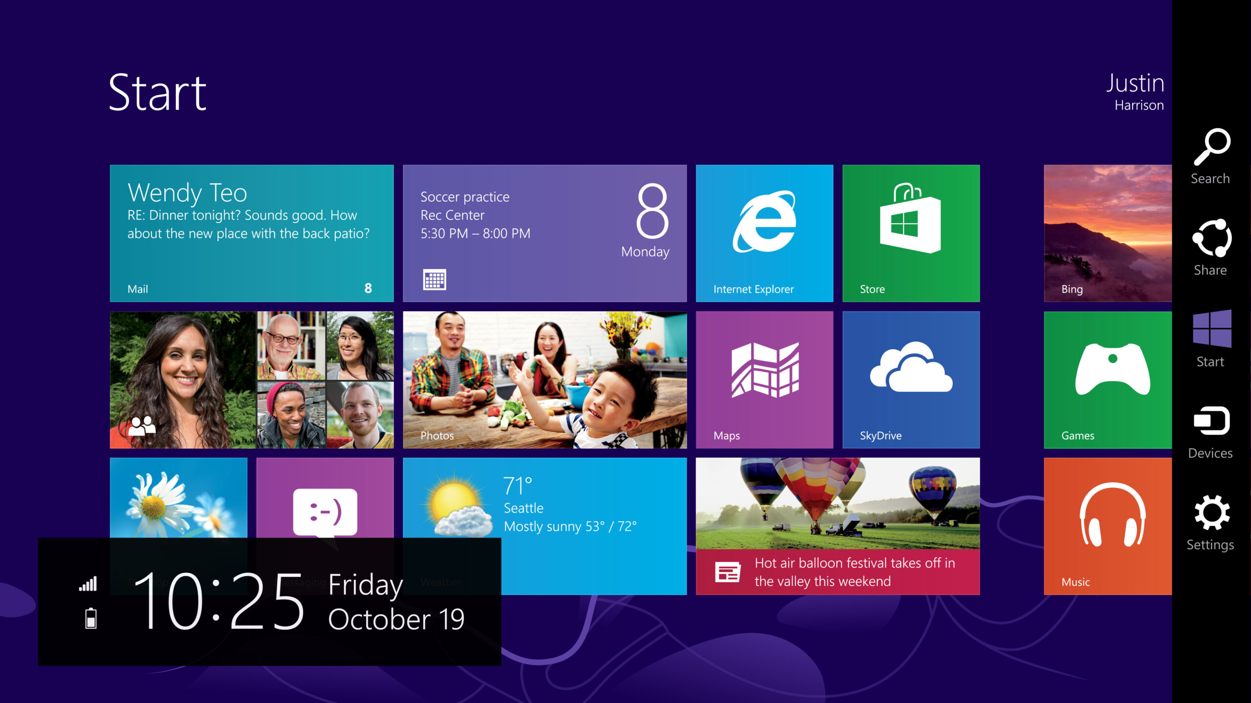
The new Windows 8 “start screen” (pictured above) is made up of a series of re-sizable, re-positionable “live tiles.” Live tiles are the single most distinguishing feature of Windows 8, they are the blocky user-interface elements that tie the operating system together across devices. Windows Phones have live tiles, the tablet and desktop implementations have live tiles and the xbox has adopted a UI the resembles live tiles somewhat.
I’m going to be honest, live tiles make icons looks old fashioned. Live tiles are constantly updating with new data from the internet: the weather app shows you an up to date forecast, the “people” app shows you icons of your friends who’ve recently posted an update to any (any!) social network, the news app gives you breaking news, you get the idea. There is simple no way to accomplish this with your standard 32×32 iOS or desktop app, Android’s gadgets are a step in the right direction. But I have to say, I think Microsoft is on to something.
“Optimized for thumbs”
Windows 8 seems to be designed to function best on a tablet in landscape mode. I suspect Microsoft sees this as a distinguishing feature in-and-of-itself, when compared side by side with other tablet OSes which are designed for portrait view. The soccer mom rep really emphasized that Windows 8 is “optimized for thumbs” (as if it were an un-marketed catchphrase). Much like the Blackberry playbook, Windows 8 attaches gestures to the edges of the screen. The right edge brings up cross-app search, universal “sharing”, the start button, device and start screen settings. The left gesture cycles through open app. I’m mentioning this as a unique feature, not necessarily a good one. These edge of screen swipe gestures always strike me as a little clunky.
Picture Unlock
Instead of setting an alpha-numeric, Windows 8 allows you to customize your login background imagine, which you then use as a reference for tracing a “password”. For example, the music guy had his a photograph of his hotrod, he traced around the headlights and left fender to unlock the device. I’m always fascinated by the length manufacturers have to go to get avoid patent infringement. I’m not really sure what sort of affect this will have on actual security – positive or negative.
Pinning
I think that’s what they called it. Windows 8 is designed around full-screen apps. All apps open to take up the entire screen. This has some fairly obvious workflow implications, as Jacob Neilsen mentioned this sort of takes away from the whole “Windows” idea. Some apps – like MSN message – don’t really make sense as full screen apps.
To get around this, you’re able to “pin” apps to the left 1/3rd of the screen. When you execute a gesture the current active window becomes “pinned” app switches from a landscape view, to portrait and sit on the screen while you have other apps open. In my limited use, I wasn’t really able to gauge how practical this would be in actual use.
The Good
There is not a lot of good.
The main thing that really struck me was the integration of previously disparate Microsoft brands. They are re-focusing their music, video and game/app stores under the Windows 8 brand. No more “Windows Live Messenger email” and “Xbox 360 game store.” Like an AppleID, everything is tied to a Windows ID. All of your store purchases are available on any Windows 8 device you own. This sort of integration is table stakes for any OS in 2012 – it’s good to see Microsoft finally catching up.
Xbox presents the most interesting aspect of the unified store. You can buy a cross-platform game like Angry Birds and instantly have access to it on your Windows Phone, Surface and xbox. Presumably full-fledged Xbox games are able to have Windows Phone compatible mini-games. Genius.
Oh, and Windows Music.
Microsoft have managed to cobble together a competitor for Rdio and Spotify. For $9.99 you get access to 30 million song across all Windows devices including xbox (though you’ll have to have a $60/yr “gold” account to access the service on your xbox).
The Really Bad
The Desktop App
All legacy apps and non-native Windows 8 applications run inside (what Microsoft is branding) the “desktop app.” As far as I can tell, this is the Windows 7 desktop, minus a start button. It behaves very simliar to every version of Windows we’ve seen in the past 17 years since Windows 95 – in fact, it looks pretty similar to Windows 95, only bubblier. According to the PR reps the desktop app is for “productivity,” whatever that means. On a traditional desktop PC, desktop app is a good option for desktop users who will undoubtedly need to run legacy apps, or who may have a hard time using and adjusting to the radical new “start screen” UI.
Unfortunately, on tablet hardware, the desktop app utterly destroys the user experience. I inadvertently asked the rep to show me task manager (which is oddly linked on the “log out” screen), upon loading task manager the Surface hiccups into the desktop app…I nearly vomited in my mouth, suddenly a reasonably nice tablet experience was interrupted by this antiquated GUI.
BTW, Microsoft Office for Windows 8 runs in the desktop app.
Soft Cover Keyboard
It’s unusable.
Conclusion
I have very mixed feelings about Windows 8. Microsoft is doing a lot of things right. They’ve essentially built a responsive operating system that works well across different devices and screen configurations. Live tiles are a real step forward in UI. The brand unification, music streaming and app stores are long needed improvements.
In other ways, it’s bad. The Live tile based start screen UI is going to alienate a lot of traditional desktop users, it simply doesn’t work well without touch input.
If I was presently running Windows 7, I probably wouldn’t upgrade.
If I was in the market for tablet, I would consider a Windows 8 device.
Leave a Reply
Only people in my network can comment.